Milka
The Milka logo revitalization was one of the exercises at the Wojtek Janicki classes of Visual Identification. The trip was interesting, because I was able to trace the design development of the Suchard chocolate packaging and discover some beauties. My proposition is not a radical departure, as I think the current Milka logo is very good and I almost like it.
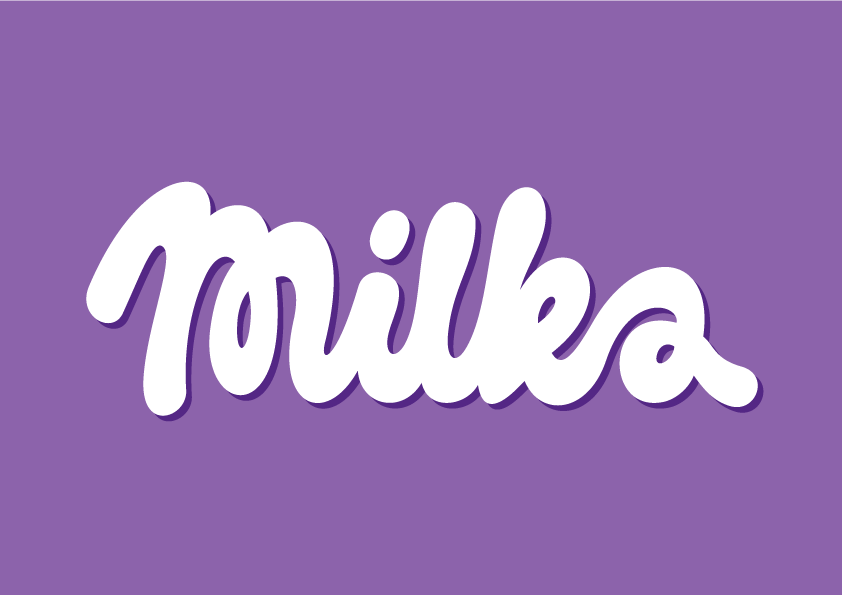
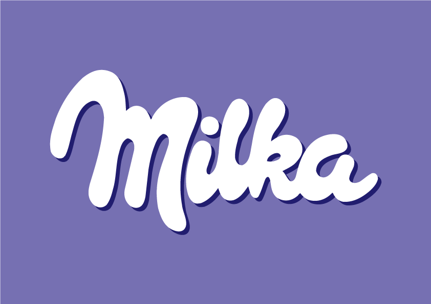
For me personally the most painful thing was the diagonal skew of the original logo – definitely the classic Swiss landscape stands behind this design decision, but I think that now Milka belongs to the whole world, so that little slope can quietly retire. The new logotype is more friendly and relaxed and chocolate – everything is painted in one smooth stroke, with the isolated “M” problem not existing anymore. It is especially important now, when Milka wants so much to connect people together in tv commercials. Liliac color has warmed a little, because the evolution of packaging suggest such a change.
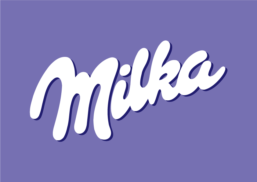
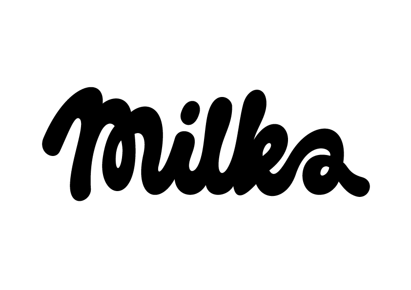
Above is the original logo that Milka uses on all its products – and below is the same logo, but unskewed by these painful 19 degrees:
And few years ago in Germany, at the German competition of drawing cows – which was attended by 40k German children – as many as 30% of them draw it in liliac colour.