AteGood
As a part of the work at Trewebs my main task was to design a semi-startupish lifestyle-nutritional application.
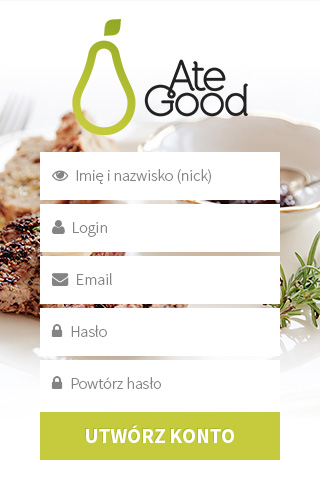
The project already had its own logo, but it required some fine-tuning of the mathematical details, some cleaning up of unnecessary and bad anchors, and improvement of the colour palette with an emphasis of the creation of missing RGB counterparts.
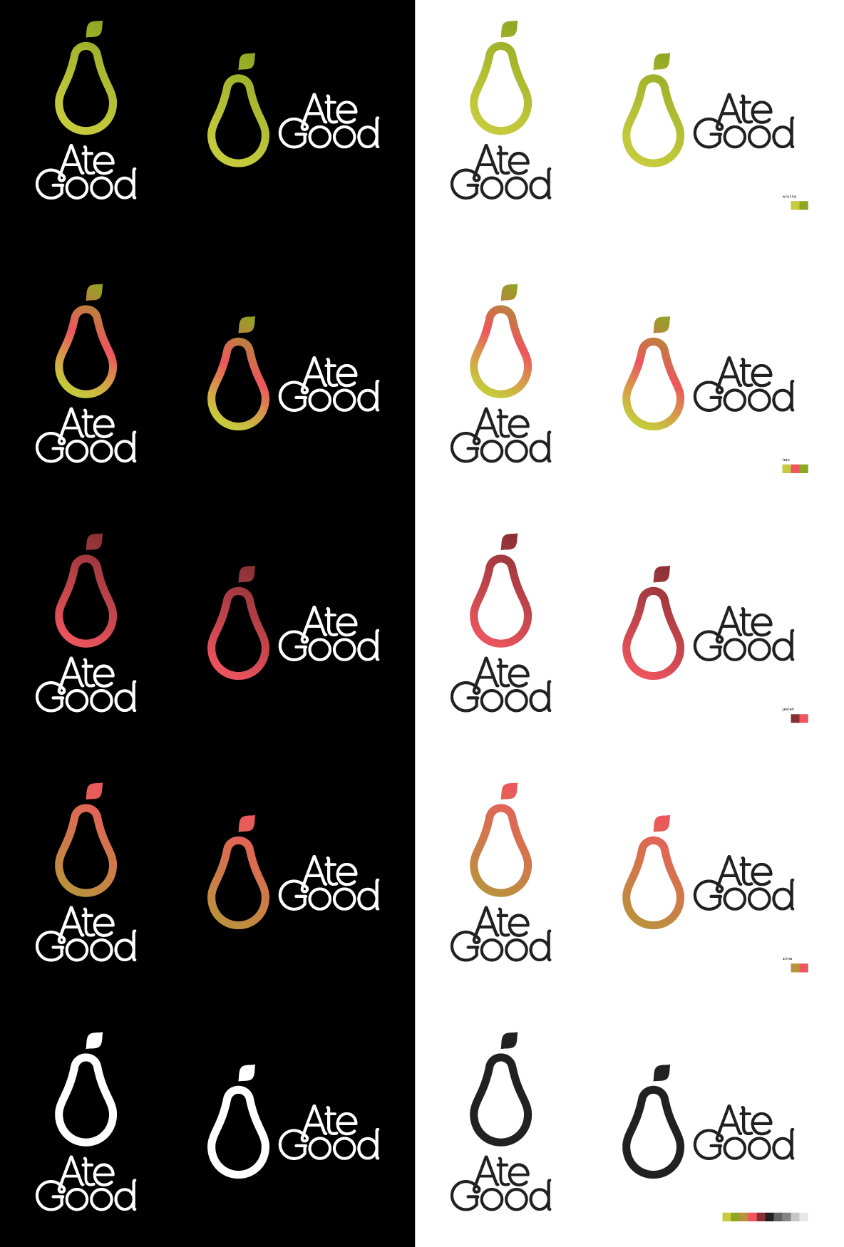
Finally I created a small family of logotypes with tasty colors, adapting to the seasons. It’s a small move towards the natural, healthy food.
The entire application was consisting of main three pillars:
- A diet with automatic, intelligently customized list of meals
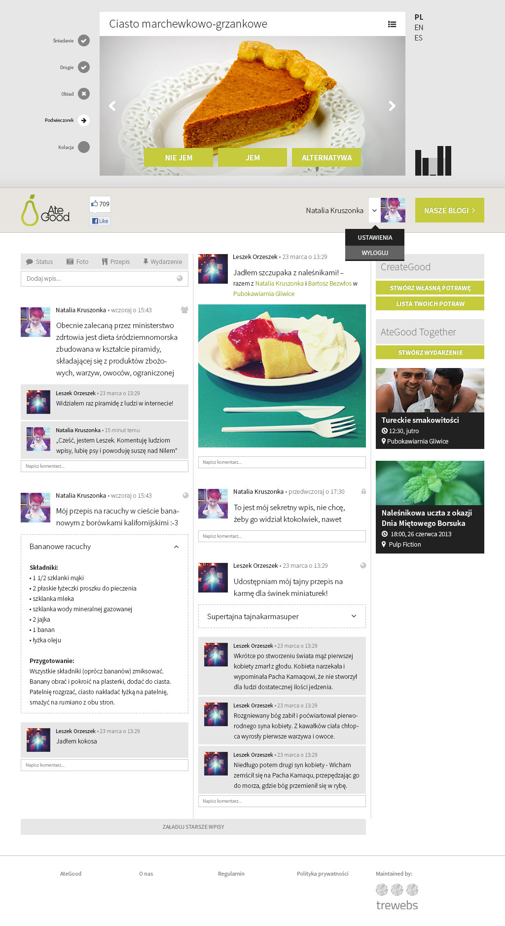
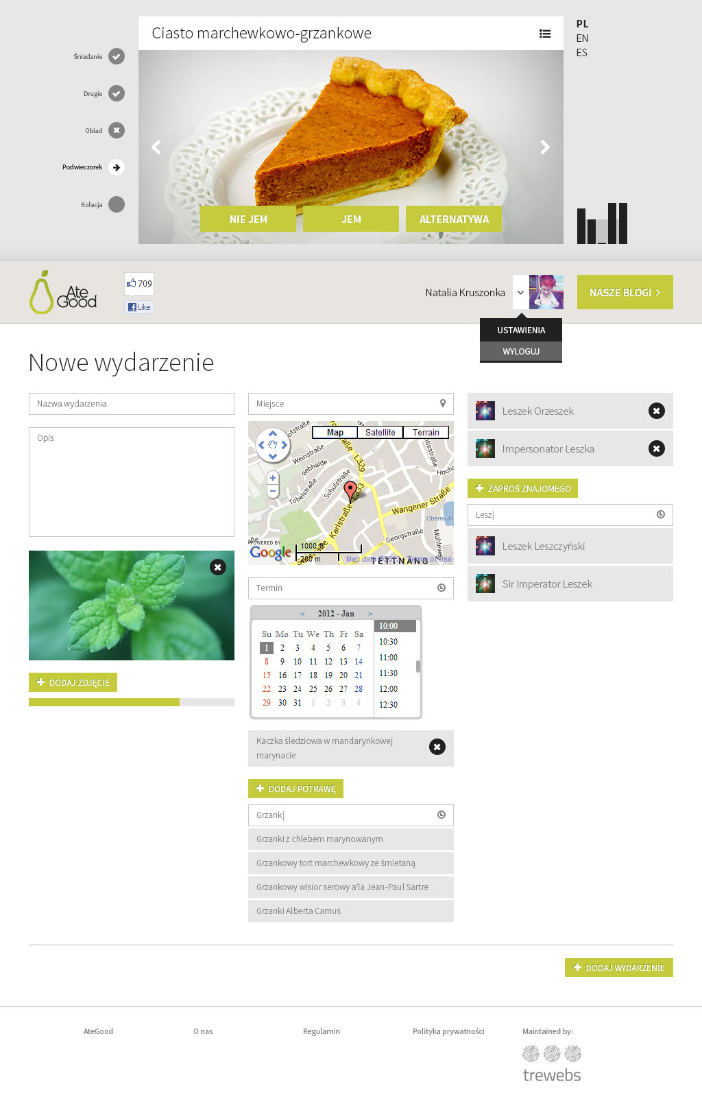
- A community with events and recipe exchange
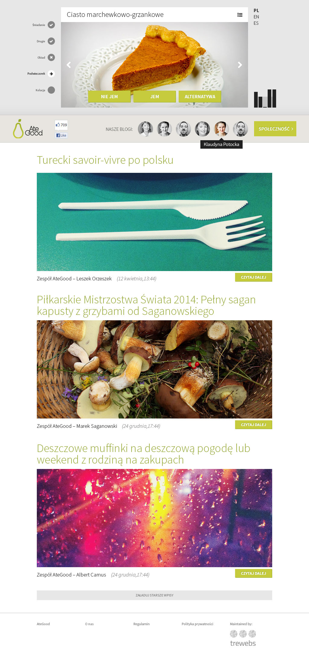
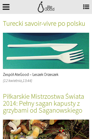
- A lifestyle blog with the reviews of food-releated places
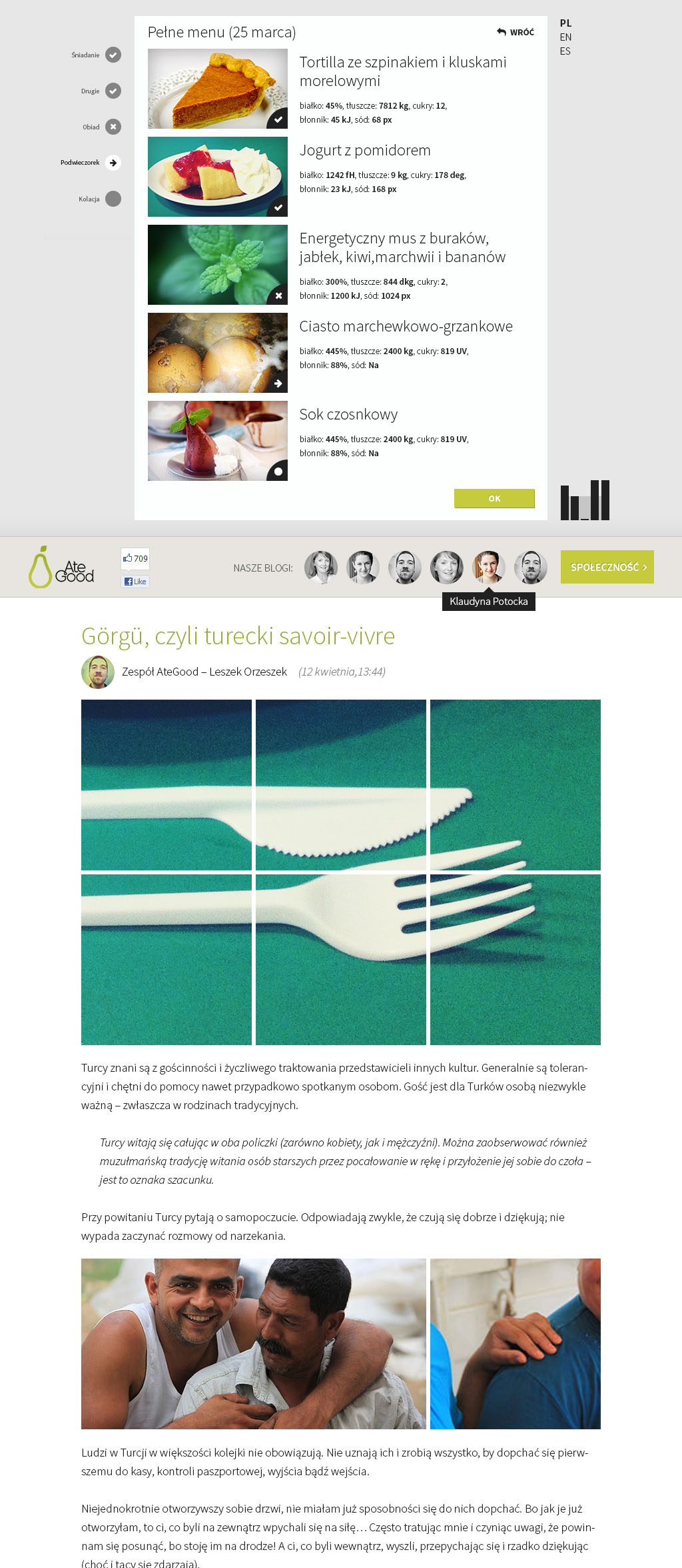
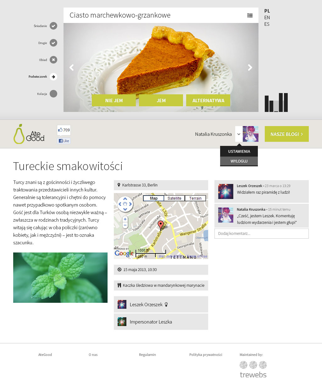
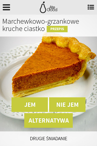
The main stem was supposed to be an intelligent AI system which generates the list of meals – under the control of the Dietitian Sandra and with the help of delicate personal information – that’s why its interface ended up in the header of each site (in desktop version).
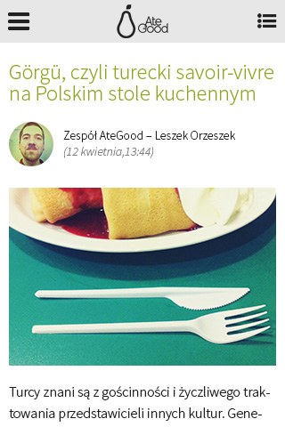
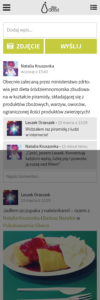
In the mobile version, the whole thing was split to the standard screen-sections, with the majority of the secondary functionality hiddend in the mobile-menu.
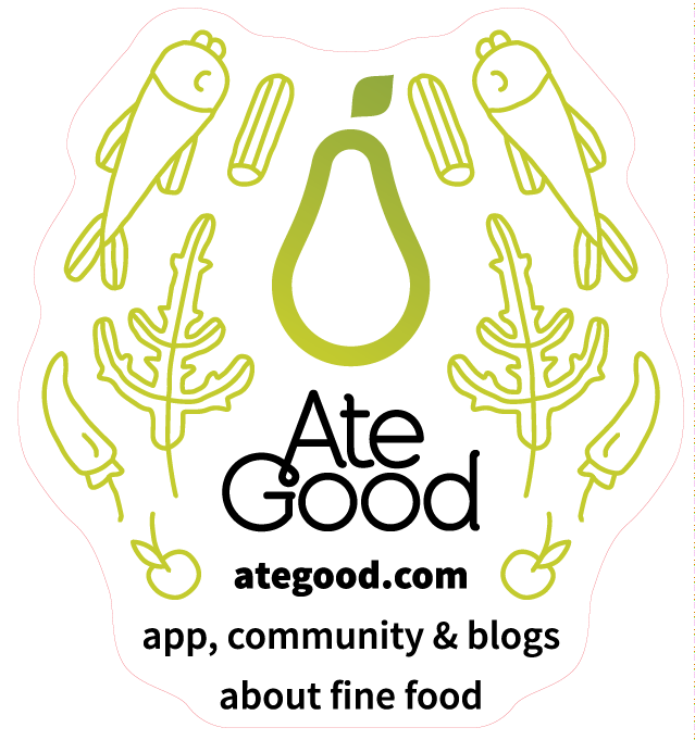
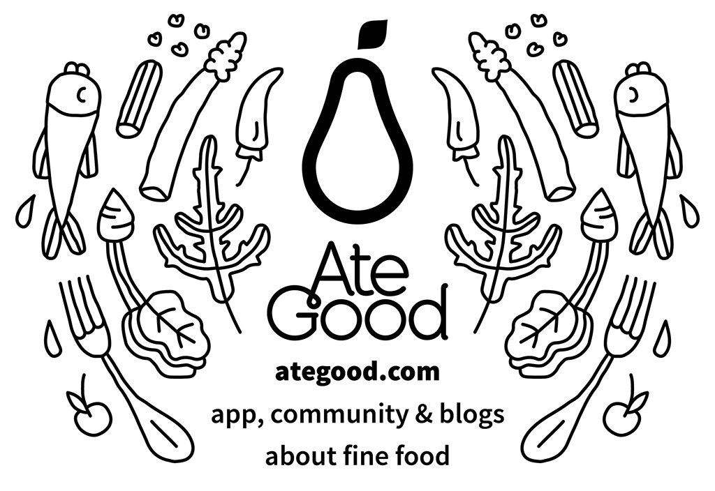
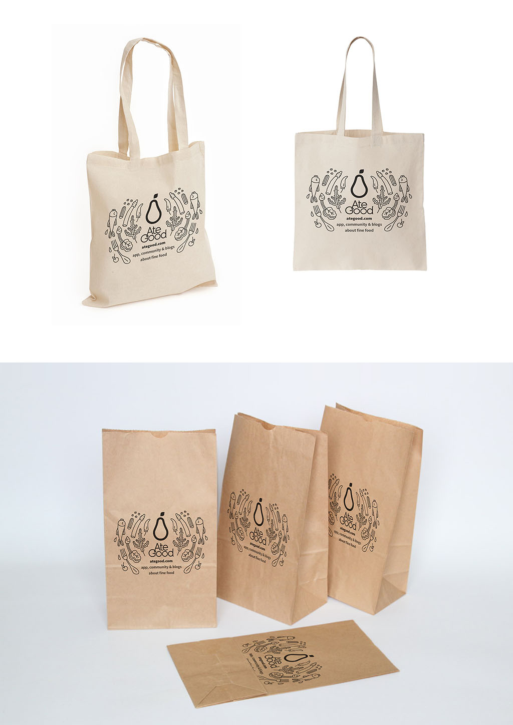
As a part of the promotional campaign, the funds allowed for the creation of few gadgets: some stickers and a shopping bag. Additionaly to the identity I prepared a series of simple icons-illustrations, but unfortunately didn’t have the opportunity to develop a complete and coherent design system.
